FacebookTwitter

Easy-to-understand font and clear, stimulating illustrations to aid the reader

Clear, Stimulating Illustrations
Illustrations account for a huge part of a reader. Well illustrated readers should stimulate the children and clearly illustrate the language they are intended to complement.


Clear, stimulating illustrations to aid the reader

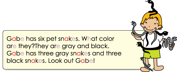
While overly detailed illustrations may stimulate the reader, we also need to be careful not to include too much detail in illustrations, to avoid confusing the reader. The most effective illustrations will complement the language by clearly and unambiguously illustrating the meaning of the language it relates to.


Clear, stimulating illustrations to aid the reader
 
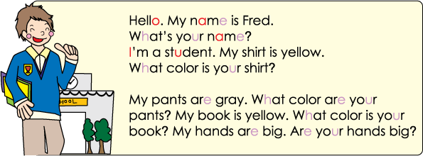
Easy-to-Understand Font
When choosing a reader suitable for our school and students, we obviously want to choose a reader with a very simple, generic style font that is easy to understand and matches the writing style the students are learning. The font used in Fun Phonics Readers matches the font used in Finding Out, avoiding confusion for students, as can be seen below.

An easy-to-understand font avoids confusion for emerging readers

Buy Fun Phonics Readers Book 1 Fun Phonics Readers: An affordable reading program for any school. Click to learn more.

Watch our English Learning Videos for Children

Our songs on iTunes

Our learning materials on Amazon

Our songs on YouTube Music

Listen on Spotify

Shop in Japan for our materials from the ETJ Book Service


Customer Comments

Receive Our Newsletter

For teaching tips, free learning resources and updates...subscribe :)

Our Facebook Feed

Fun Kids Videos


Who's Online

We have 171 guests and no members online